
MINTED | 2018 BRAND REFRESH
art direction, design, brand development, packaging
Minted is a premium design goods brand selling stationry, art, and home goods created by independent artists and designers. The company sources art and designs from their community of more than 16,000 independent artists from around the world through an innovative voting process that reliably predicts which designs will sell.
As the Senior Brand Designer, I worked closely with the Creative Director and Senior Leadership team to complete the company’s brand refresh, marking their 10 year anniversary. We started with the assets with the longest lead times like packaging before transitioning to direct mail and then on to rolling out the rebrand to the team’s digital marketing team. Stategically we wanted to transition the brand subtly, but to redirect the look and feel from Minted’s past crafty and DIY aesthetic to an upscale, luxuruious and artistic feeling, highlighting the unique value Minted’s community of Indepedant Artists bring to their goods.

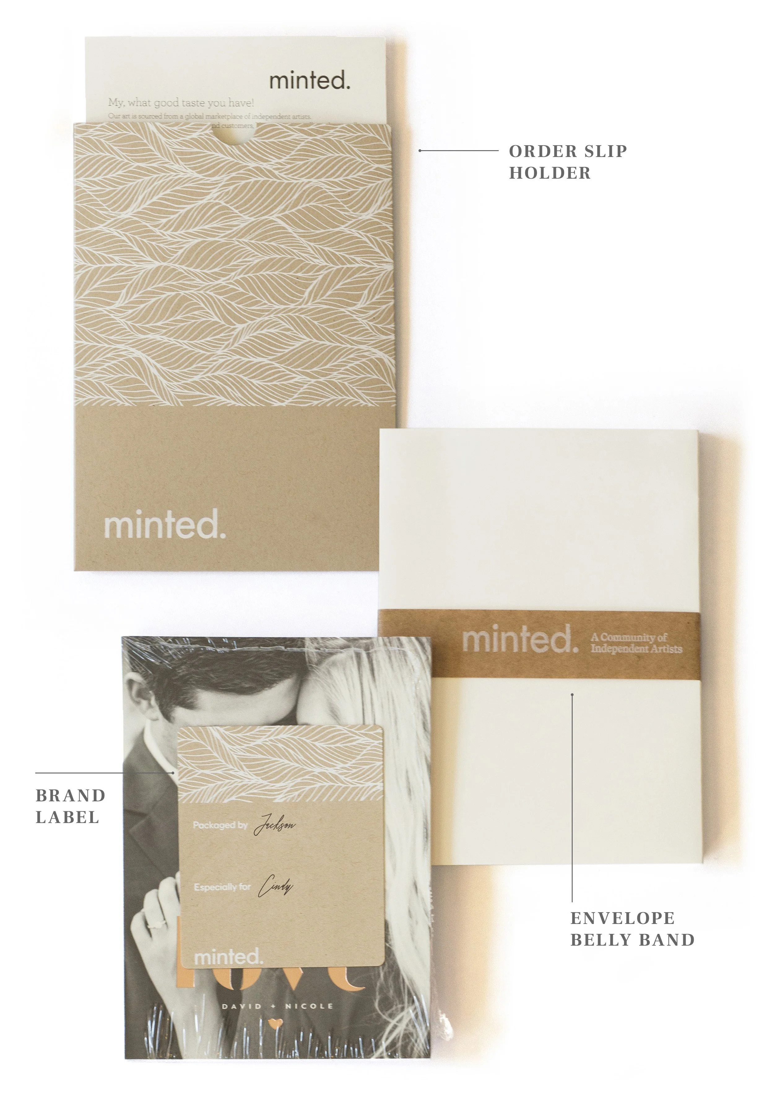
DIRECT TO CONSUMER PACKAGING
To drive home the artistic and luxury principles we were moving into we landed on the use of halftone images of our artists on the exterior of the boxes, evoking the feeling of independent zines and paired them with unique and refined patterns designed by our Artists. Together, they combine for a refined look that clearly communicates the brand’s core differentiator. Carefully crafted quotes on the interior flaps of boxes weave together humor and inspiration.


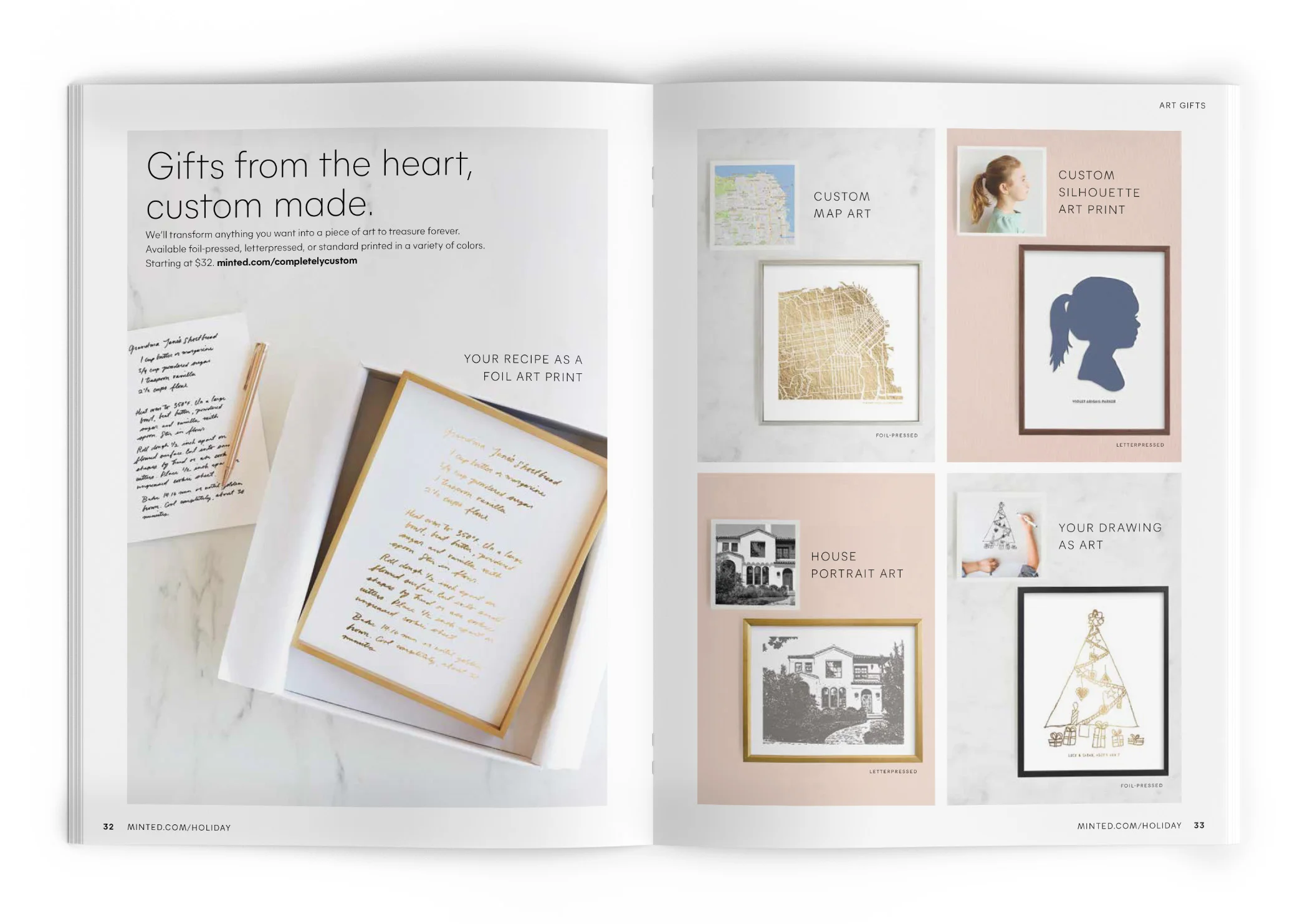
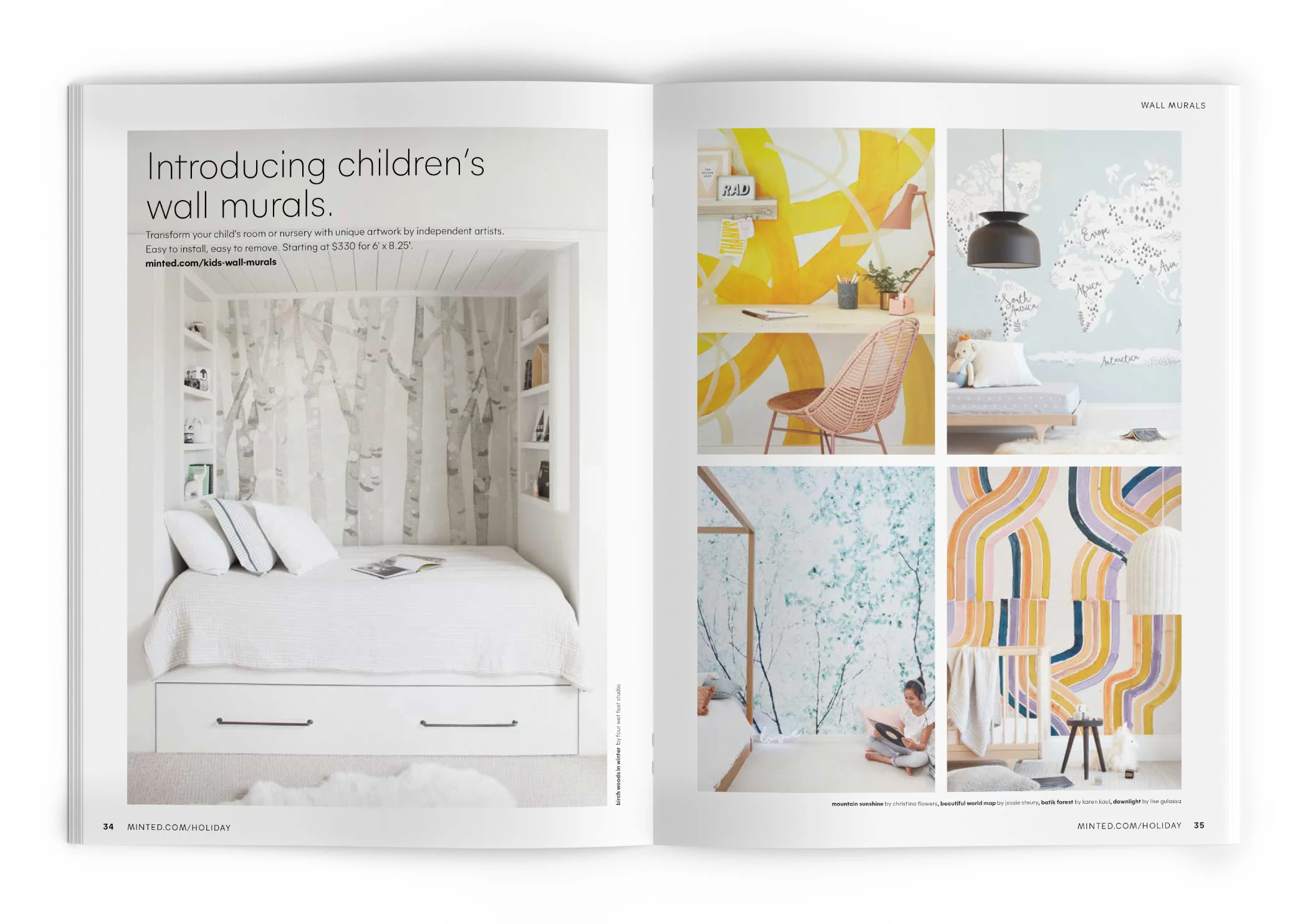
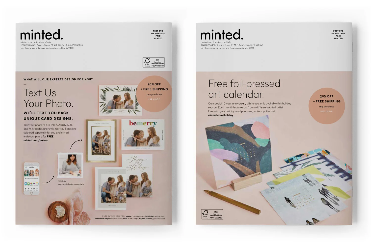
CATALOG
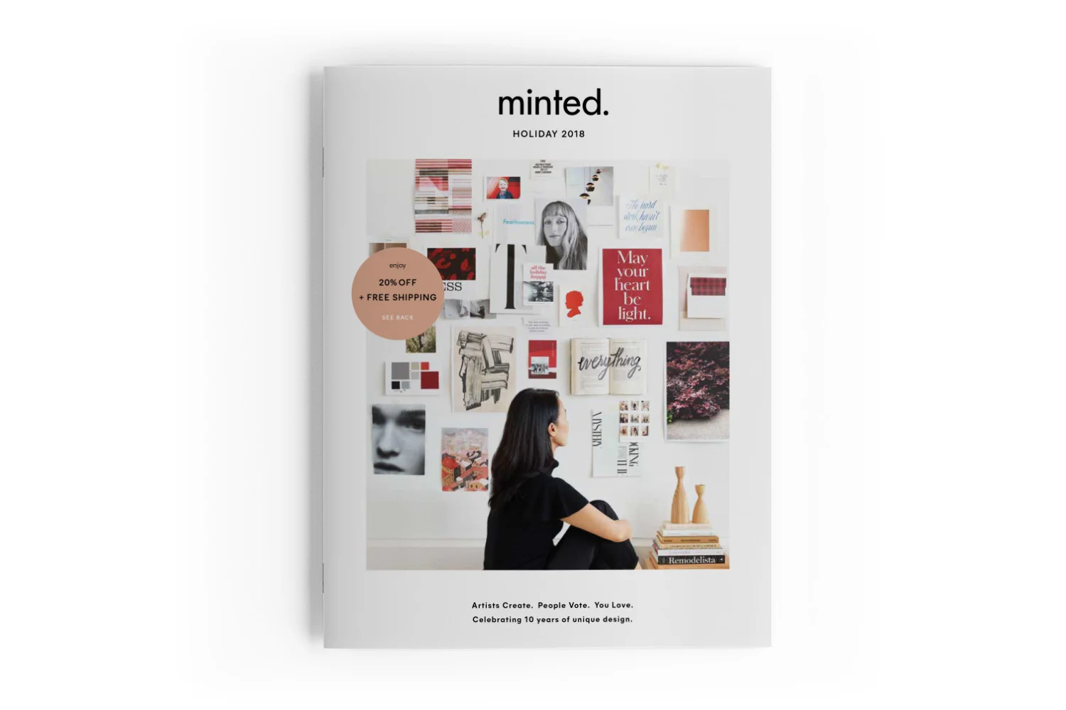
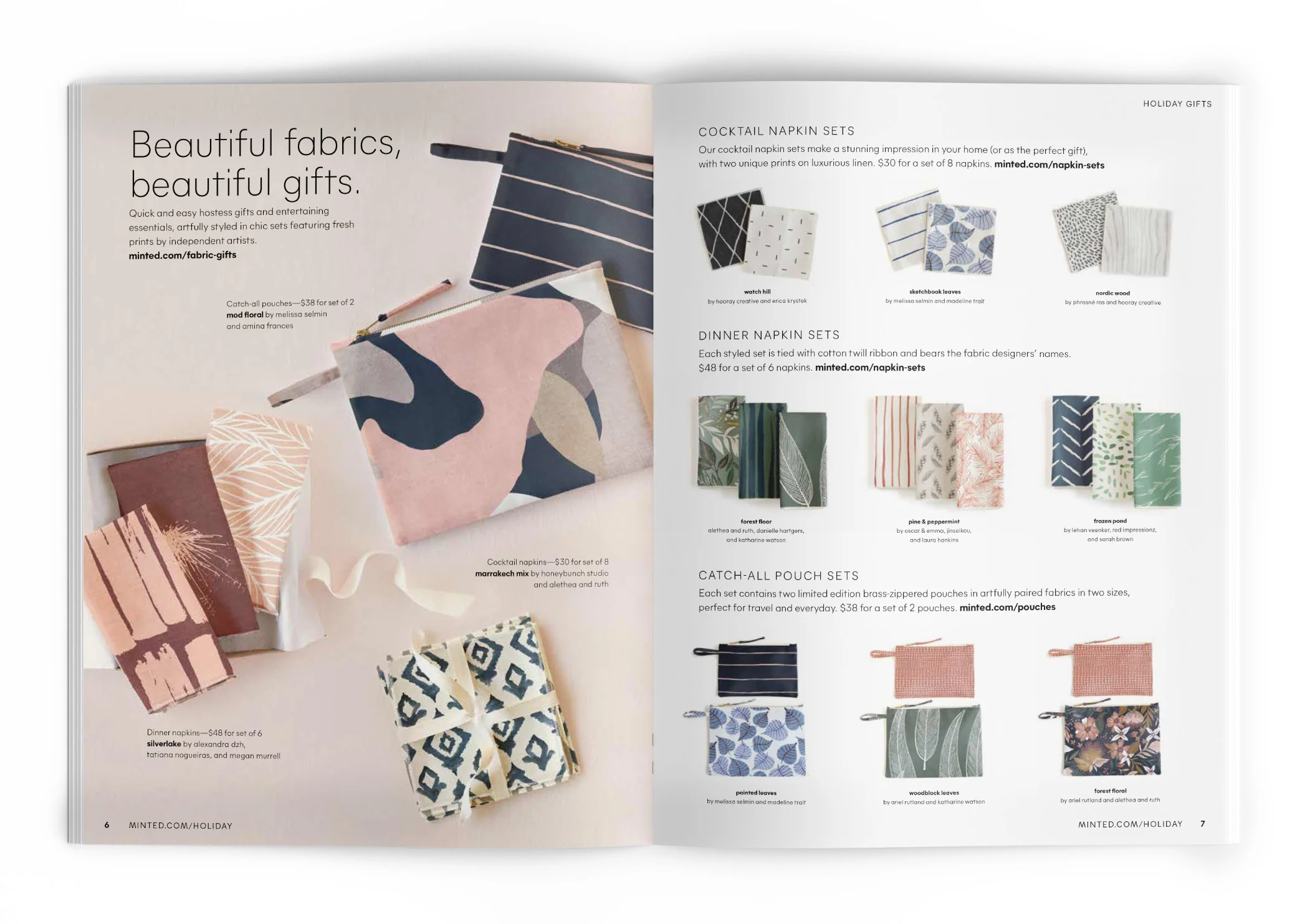
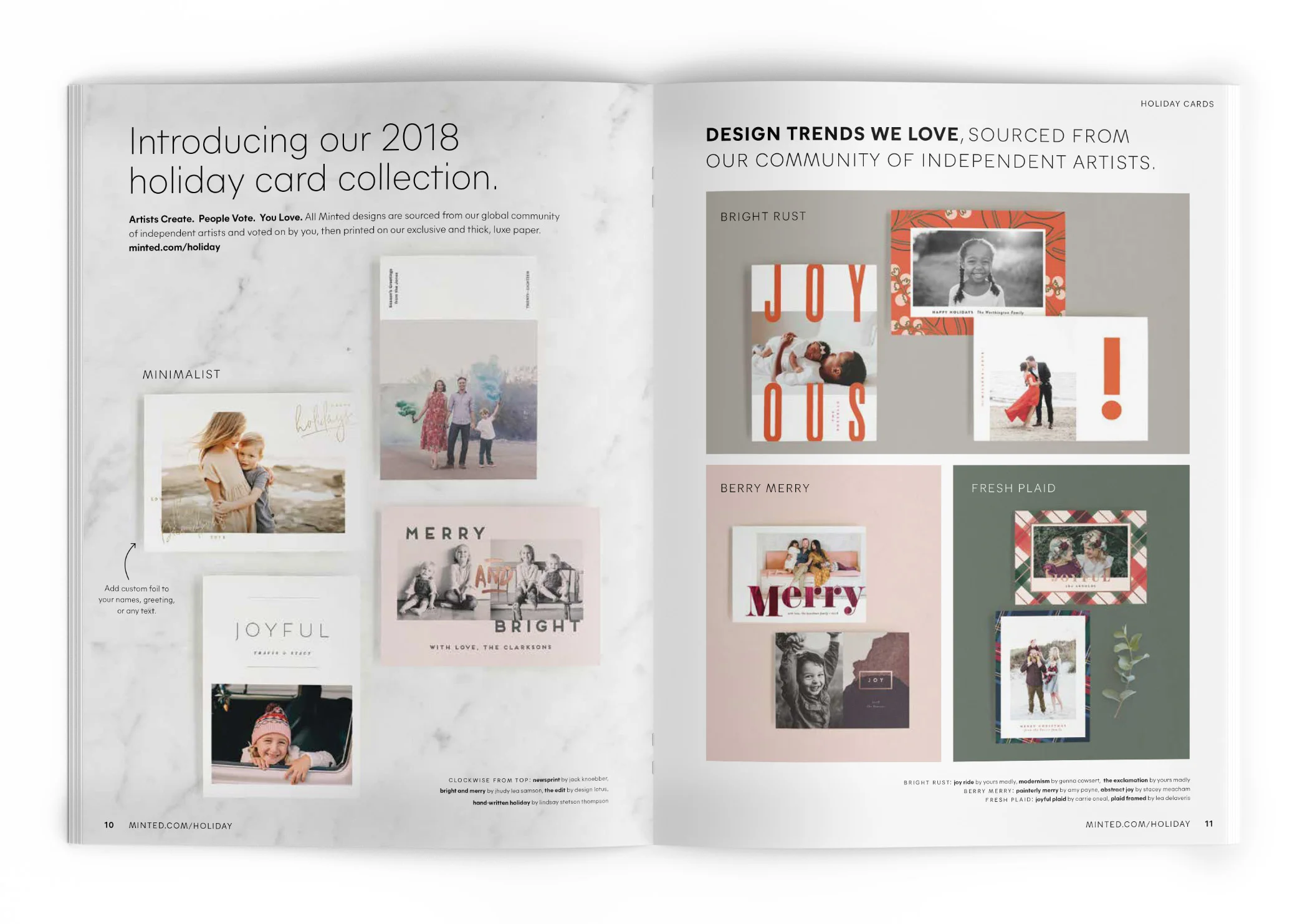
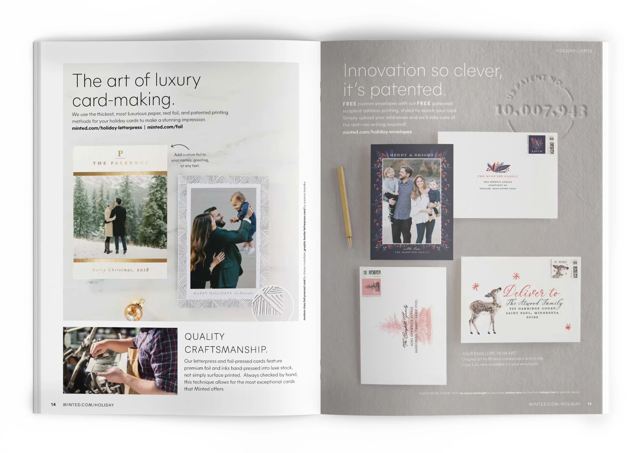
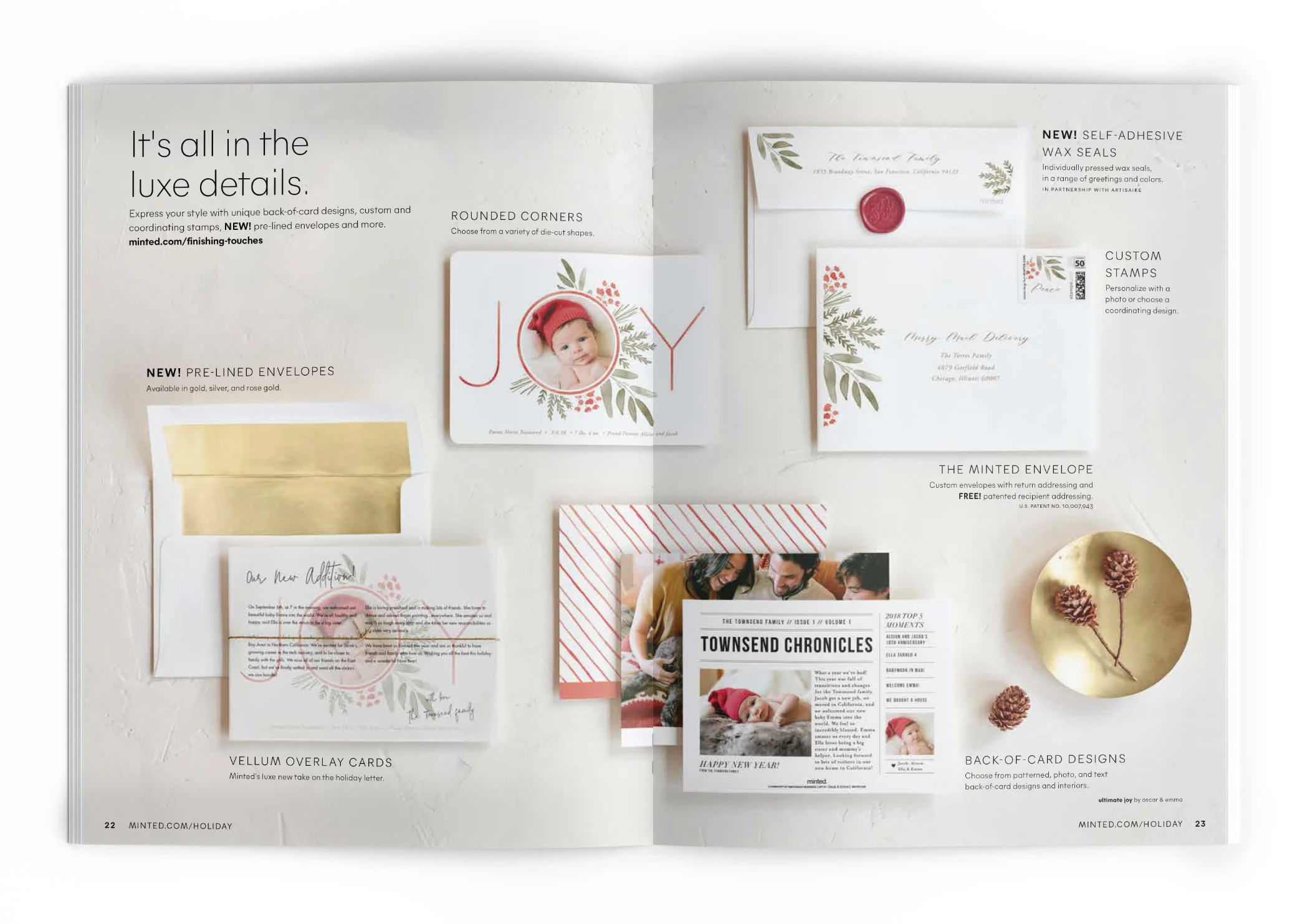
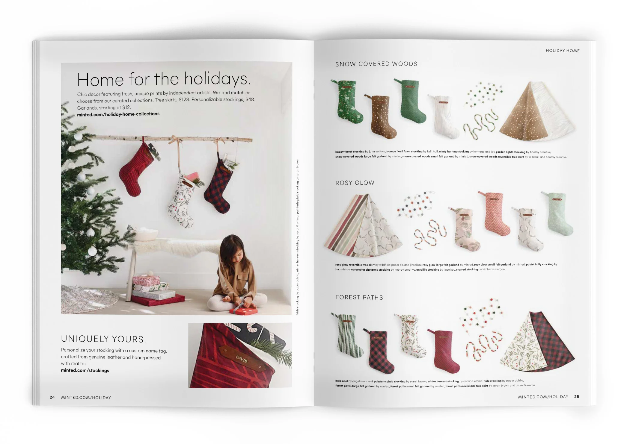
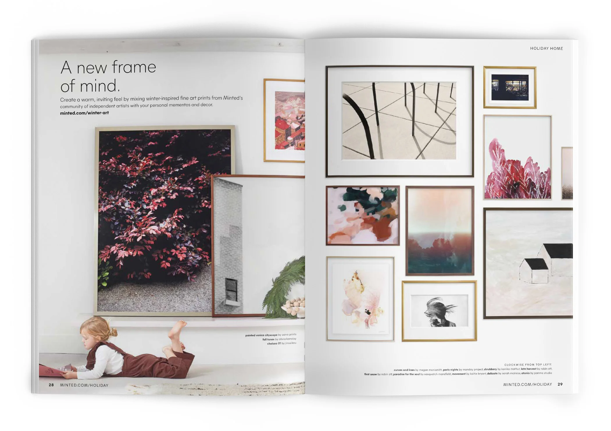
With longer lead times for our printed pieces, the 2018 Holiday catalog was the first marketing element we tackled. This piece marked the first large-scale application of Minted’s new brand guidelines and meant rethinking everything we’d done in years past. I concepted and rolled out across all channels new typography and layout standards to pair with the updated photo aesthetic being developed by the Creative Director. Like the updates I had just spearheaded to the packaging, the look needed to be luxurious and fresh while staying true to our focus on creatives.
These principles were combined with the 2018 Holiday Style Guide, inspired by the modernist movement of architecture. Each composition provides a thoughtful structure to showcase aspirational product in an accessible way. Throughout the featured images, evidence of human life is beautifully present—down to an unfinished cookie.
As the Lead Designer it was my responsibility to develop the strategy and pagination for this project in close partnership with the CEO of the company given the significance of both the category and the rebranding project. I directed the Production Artists in the aesthetic of the assets and provided guidance on layout, including hands-on support. As needed, I stepped in to assist the Creative Director in providing Art Direction to our Photographers.


IN-STORE SIGNAGE
As part of the brand refresh we also needed to update the various elements of our greeting card presence in our partner retailers. This included both the packaging and in store signage and presented an excellent opportunity to review the effectiveness of our current presence. Our instore presnce focused on approachability and clearly communicating our key market differentiator as a brand supporting independent artists. Small touches of our elevated and luxe experience were sprinkled throughout like foil detail on the cello and carefully refined typography.

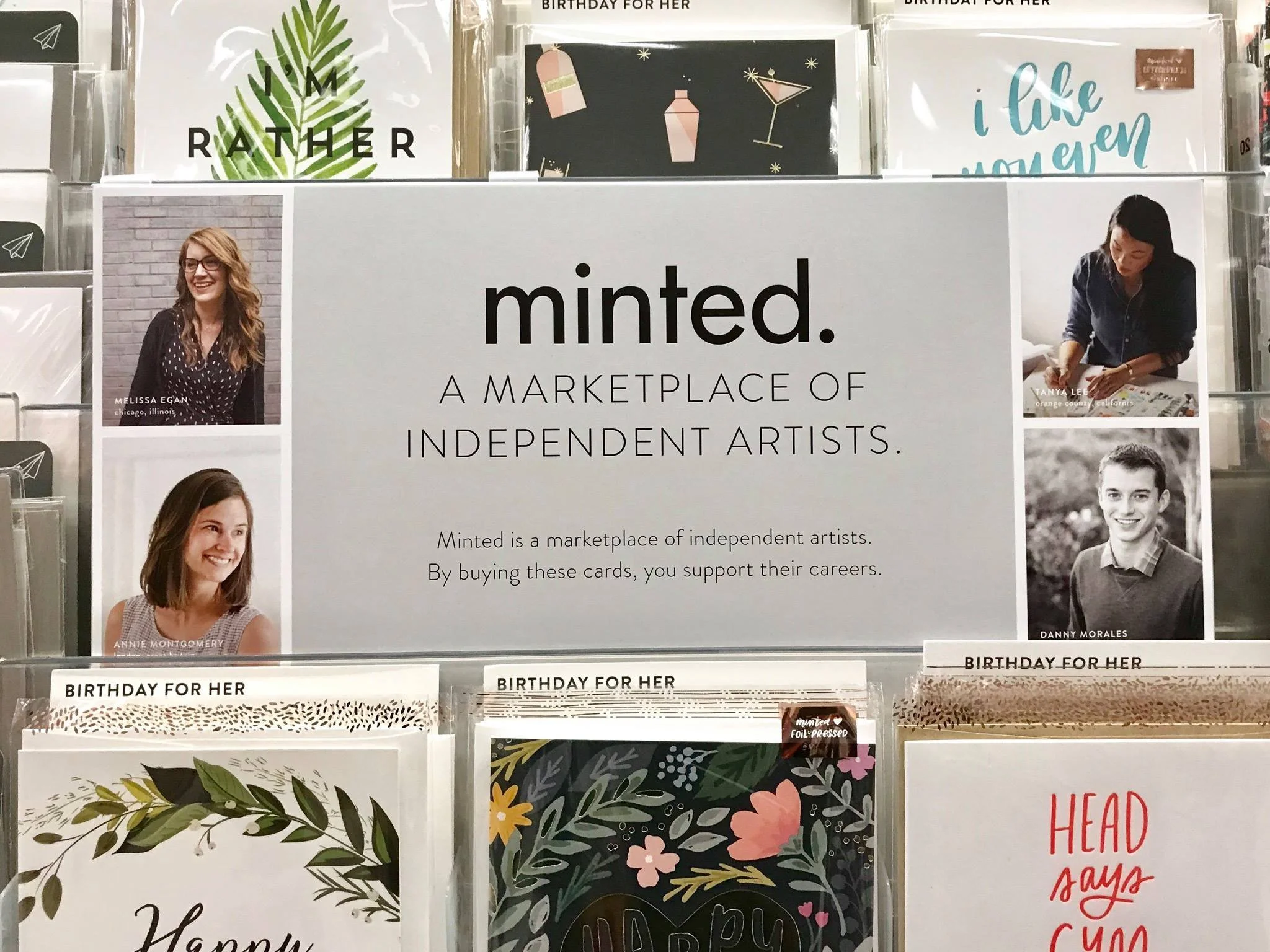

RETAIL PARTNER GREETING CARD PACKAGING
While working on the packing update, conversations with our retail partners and competitive benchmarking showed that consumers were having difficulty finding the interior caption text and were opening sealed cello to view the interior, leading to product damage. To resolve this issue I developed a new insert card layout, carefully researched to match customer expectations. Additionally, I shifted our cello to an unsealed top, reducing our production costs by nearly 0.5¢ per sku leading to major savings and ensuring that customers who chose to view the interior of the card were less likely to damage it reducing overall shrink and improving customer experience.


